SISfm - Map Enquiry guide
The basic functions are highlit in red below, click on them for details.
Facilities
Your site plans include Buildings, and may also include additional facility types. Each facility type uses terms which are equivalent to Building, Floor and Room, for example:
| Site | Building | Floor | Room |
| Site | Car Park | Level | Bay |
| Site | Landscape Precinct | Zone |
This guide refers to Building, Floor and Room; terms such as those above should be substituted when referring to other facility types.
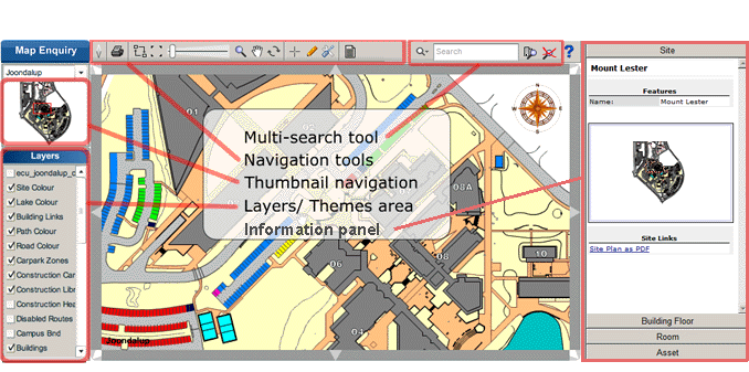
Multi-search tool
The multi search tool allows you to search for buildings, rooms, people, assets and documents.
Search text is processed as terms normally separated by spaces.
The following search terms can be included:
- S or site (or C or campus) followed by a site code or a term which site names contain, for example s JO or campus joon.
- B or building followed by a building code or a term which building names contain, for example b 2 or building law.
- F or floor (or L or level) followed by a floor code or a term which floor names contain, for example f MZ or level mez.
- R or room followed by a room code or a term which room names contain, for example r 101 or room office.
- A or asset followed by an asset code, an asset standard, or a term which asset names contain, for example a EQ54322 or asset piano.
- D or document followed by a term which document names contain, for example d safety or document elec.
Building search results are shown if a site or building location search term has been included, or if a building name contains any other term.
Room search is performed according to room feature settings configured by your system administrator as follows:
- Conditional search - configured keywords with optional condition and value terms following. Condition terms are = > < >= <= <> meaning equal to, greater than, less than, greater than or equal to, less than or equal to and not equal to, and do not require adjoining spaces. For example:
- capacity>9 to find rooms for more than nine people.
- capacity 10 to find rooms for ten or more people, as this keyword is defined with "greater than or equal to" ( >= ) as its default condition.
- whiteboard to find rooms with whiteboards, as this keyword is defined to require no condition or value.
- whiteboard capacity 10 or capacity 10 whiteboard to find rooms with whiteboards for ten or more people.
- Text search - any other terms are compared with the values of configured room features, plus the room name, and match if a value contains the term.
People search works as follows:
- A single search term is matched with both first and last name, and with the person ID.
- If there is more than one search term, the first term is matched with first name and remaining terms are matched with last name, for example John Van Smith.
- If the entire search text contains a comma, the text before and after it are matched with last and first name, for example Van Smith,John.
- In each case a match occurs if the name contains the search text, or if the ID is the search text.
Asset search may be qualified by site, building, floor and room terms to restrict results.
Document search may be qualified by site, building, floor and room terms to restrict results.
If multiple facility types are in use, and the first term is a facility type (e.g. CP for car parks), then the building, floor, room equivalents for that facility type are searched instead. In this case, note that the above building, floor, room keywords should still be used to refer to their equivalent facility types.
Enter your search text in the search box (in red below) and the results will display in the box marked in yellow.
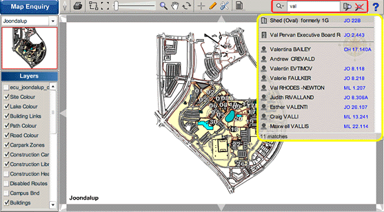
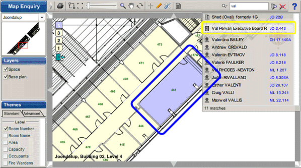
Clicking on a result (in yellow below) will find the correct map, zoom in on it and highlight it.
The icons on the left of the search results indicate a building, room, person or asset as a result.
Clicking a building result will highlight the building on a site map, choosing a room or person will go to the building plan as shown above.
Clicking an asset result will go to its room on a building plan for room based assets, or to a site map with a pin marker for location based assets.
The Search Hints button, to the left of the search box, displays a menu of keywords, such as site building floor room as above, the names of room features to search on, and other useful search text, as defined by your administrator. If multiple facility types are in use, this should include the facility type codes and their meanings, e.g. cp (car parks).
The Clear Search button, to the right of the Search button, clears any visible search hints menu, text and results. Clicking elsewhere also clears the search hints menu and results.
Navigation Tools
Show/Hide Menu
 Use to toggle the left menu off and on. The menu width can be resized by dragging its right hand edge.
Print current view area
 Use to create a print of the map, with a title identifying the site or building and floor.
If more than one print template has been defined, or if any template contains additional title fields, a Print menu is displayed. Select the required template, then enter text for each field if desired, then press the print button underneath. Press the toolbar button again to hide the menu.

If print previewing is enabled, the print is displayed with the drawing toolbar, which can be used to add information to the print frame (see Drawing), and which contains a print button to print and a cancel button to cancel printing.

Note: print previewing requires the same printer and its preferences to be selected a second time, due to a Flash limitation.
Note: if instead you use your web browser's print command, the entire page including the user interface will be printed.
Previous View
 Return to the previous zoom area on the same map.
Full Extent
 Zooms the map to enclose all data, or to the initial view if the Home Extent button is not available.
Home Extent
 Zooms the map to the initial view. This button is available when displaying maps whose initial view is zoomed in.
Zoom to Scale
 Zooms the map to a specified scale. A Zoom to Scale menu is displayed. Enter the desired scale, followed by Enter, or press the Zoom to Scale button. Press the toolbar button again to hide the menu.
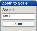
Note: the resulting scales are approximate, and intended for use in comparing different plans at the same scale.
Zoom Map
 Move the slider right/left to zoom in/out about the centre of the map area. Click on the slide bar to the right/left of the slider to zoom in/out by a factor of about 1.4 (two clicks is a factor of 2).
The mouse wheel can also be used to zoom the map about the pointer position when using the Microsoft Windows operating system.
Zoom Magnify
 This tool has two functions:
- Single-Click: Similar to Zoom map but will zoom on whatever object is clicked on.
- Click-and-drag: Zoom the chosen area to full size.
Pan Map
 The default tool for navigation, can be used to drag the map around, click and move in the direction you wish to view.
Rotate Map
 Use this tool to rotate the view, with a click and drag action. Initially site plans are aligned to North, and floor plans are aligned either to the site or to the building (as defined by your system administrator). The compass indicates North, and if clicked will reset North alignment, or toggle a floor plan between site and building alignment.
Locator / Ruler
 This tool has up to three functions, depending on configuration:
- Mouse hover: Displays location next to the cross hair
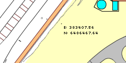
- Single-Click: Places a pin at the location and displays the co-ordinates in the interface on the left to allow you to copy-and-paste into the application of your choice.
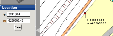
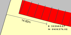
Press the Clear button to remove pins and measurements. - Click-and-drag: Measures the distance between two points.
If the Location menu is not available, select the Drawing tool and press CLR to remove measurements.
Drawing tool
 This button activates the drawing toolbar which has a number of functions designed to mark-up a drawing before printing it.The drawing tools are particularly aimed at providing directions or highlighting rooms.
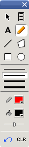

- Selecting or deselecting active items (e.g. rooms on floor plans):
- Click an active item to select or deselect it, or
- Drag a rectangle over many active items to invert their selection, or
- Shift-click an active item to select or deselect all items in the same group.
Selected items are coloured using the current fill colour. If an unused fill colour is used, a legend entry will automatically appear. (See Editing legends below).
Item groups may be defined by a delimiter (e.g. "-" to group rooms A-B-1, A-B-2, etc) configured by your system administrator.
- Deleting drawn items:
- Move over a drawn item to highlit it, then press the Delete key to remove it.
 Item Link Tool (optional) - send selected items to a web page whose functionality is defined by your organisation, and described in its tooltip.
 Text Tool - draw text in the current line colour. Click at top left, type text, click to end.
 Pencil Tool - draw freehand in the current line colour and thickness.
 Line Tool - draw a sequence of straight lines in the current colour and thickness. Click again at the first or last point to finish.
 Area Tool - draw a polygonal area in the current fill and border colours. Click again at the first or last point to finish.
 Rectangle Tool - draw a rectangle in the current fill and border colours.
 Oval Tool - draw an oval in the current fill and border colours.


 Fill Transparency - slide left for more opaque fill, right for more transparent fill.
 Undo - remove the last drawn item.
 Clear All - remove all markup, and measurements if the Location menu is not available.
Custom Links
 When this button is in the pressed position, clicking the map launches a browser window containing related content defined by your system administrator. If a building (on a site plan) or a room (on a building floor plan) is clicked, this can include details of the building or room.
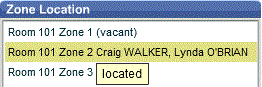
Zone Location
 When this button is in the pressed position, the Zone Location menu is displayed. This button is only available for floor plans, and to authorised users. Click a room zone in the menu, then click the plan to locate or relocate it. An icon representing the zone and its occupants is displayed (provided a suitable room zone points layer is visible). Menu items have a tooltip to indicate whether the room zone is yet located.
Report
 When this button is in the pressed position, the report window is displayed:
The report lists buildings on site plans or rooms on floor plans. On site plans, if multiple facility types are defined, pressing this button cycles between reports for each facility type. If the drawing Select Tool has been used to select items, the report only includes these, otherwise all items on the plan. Report fields are defined by your system administrator, can include any theme field, and numeric columns can be totalled. If no fields are defined for a report, that report is not available, and if neither report is available the button is not displayed. You can adjust the report window as follows:
- Move - Drag the title bar to move the report.
- Rescale - Drag the right or left edge of the title bar to rescale the report.
- Resize - Drag any other part of the edge of the window to resize the report.
- Sort - Click underneath a field heading to sort the report on that field, click again to reverse the sort order.
- Scroll - Drag report text to scroll the report vertically or horizontally if it is not all visible.
- Copy - Select text in the report heading or rows, then use Ctrl-C to copy it to the clipboard in a tab delimited format suitable for pasting into a spreadsheet application (or right-click and use Select All or Copy in the context menu).
- Remove - To close the report window press the Report button again.
Changing to a different site or floor plan resets the report size, sorting and scrolling, and removing the report also resets its scale.
Layer Legend
 When this button is in the pressed position, the layer legend window is displayed. Move, Rescale and Resize of width are available as for the report window.
Layer Download
 When this button is in the pressed position, the Layers menu title changes to Layer Download, and layer checkboxes change to indicate those which can be downloaded.
Click a ticked layer to download the file for that layer, which might be an AutoCAD DWG file for example.
Show Map Link
 Displays the current map URL. Press Ctrl-C to copy it to the clipboard, which can then be pasted into documents or emails.
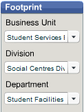
Footprint
 When this button is in the pressed position, the Footprint menu is displayed. This button is only available for site plans. The Footprint menu is used to select Business Units, Divisions or Departments (terminology may vary) with rooms in buildings on the site. With each change, a single-colour theme is applied to buildings with such rooms, and the legend shows the total number of rooms and their area. Click on the legend colour to change it.
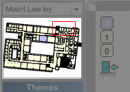
Thumbnail navigation
At the top of the left menu is a thumbnail view. A red rectangle shows the current map extent, this can be dragged to scroll the map.
Themes and Layers
This is where the various layer and theme choices are displayed. (Your login determines your access rights to this information, you may not have access to themes or layers.)
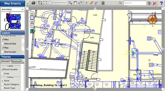
The difference between Layers and Themes:
Themes display data from our space database in a graphical manner. For example; Room number, occupancy information or square metres.
Layers are generally drawn layers from our architectural drawings. For example; Heating ducting, water pipes, stormwater drainage.
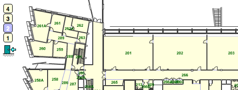
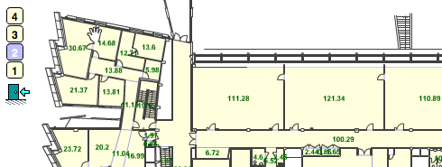
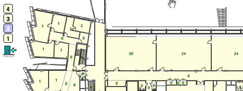
Theme examples:
- Room Number
- Area (square metres)
- Capacity
- Occupants. Move mouse over person icon for names. Icons show number of occupants up to four, the front person is red, green or blue if an occupant flag theme (e.g. fire wardens) is also selected and any occupant is flagged.
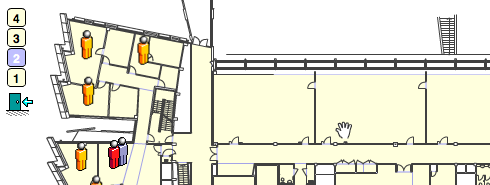
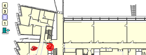
- Occupant flag theme (e.g. fire wardens). Move mouse over helmet icon for names. In addition, for a fire wardens theme, fire hose icons are shown on unoccupied rooms with names containing "fire" (such as "Main Fire Cupboard").
- Room Category or Type
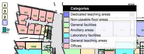
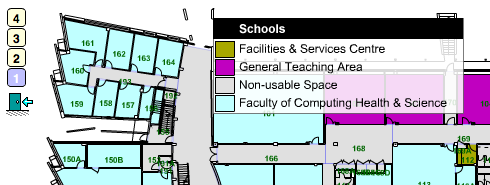
- Business Unit, Division or Department (terminology may vary)
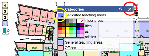
Editing legends on themes
The legend can be moved and customised.
When you move the mouse within the legend the title bar, in black above, will change to an active window, the blue bar below.
- Move - Drag the title bar to move the legend.
- Rescale - Drag the right or left edge of the title bar to rescale the legend.
- Resize - Drag any other part of the edge of the window to resize the legend.
- Change Titles - Click on a legend entry title to change its text.
- Change Colours (yellow circle) - Click on a legend entry colour to change it, using the colour picker.
- Remove (red circle) - Click on the X to remove the legend.
Removing the legend resets its scale.
If colours have been changed, the title bar includes a  button to reset them.
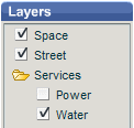
Layers
The layers menu may be shown in either flat or tree format:
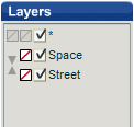
Each layer name has a checkbox next to it to turn that layer on and off.
The flat menu format may also include the following features:
- Change layer order - click a down or up arrow to move a layer down or up the list, bringing its graphics in front of or behind the layer it is swapped with. Click the button at the top to reset to the original layer order.
- Override layer colour - click the colour picker to select a colour, or to cancel a previous selection. Click the button at the top to reset to the original layer colours.
- Turn all layers on or off - use the "*" checkbox at the top to turn all layers on or off.
The tree menu format includes the following feature:
- Turn all layers in a folder on or off - use Shift-Click on a folder to turn all layers within it on or off (just click a folder to expand or collapse it).
Checkboxes and folder icons have a disabled appearance for layers and folders that are empty.
Information panel
An information panel may be displayed on the right. Its width can be resized by dragging its left edge.
Use at the right of the navigation toolbar to toggle the information panel off and on.
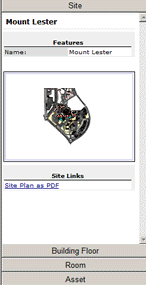
This is an accordion panel with multiple pages of information, and is updated to match other actions:
- The Site page is displayed when a site plan is displayed.
- The Building Floor page is displayed when a floor plan is displayed, or a building search result is selected.
- The Room page is displayed when a room on a floor plan is clicked, or a room or occupant search result is selected.
- The Asset page is displayed (if assets are in use) when a room details asset link is clicked.
Whenever an accordion page is displayed, details in lower pages are cleared, and details in higher pages are retained. Click on an accordion bar to display its details page.
Each details page may contain:
- Title information.
- Features information.
- Images such as photographs.
- Sets of links to other resources.
- For rooms, sets of links to their assets.
- For rooms, their occupants.
If the information panel is wide, subsequent details may be displayed in more than one column, otherwise in a single column (and if displayed, occupant details omit the department column).
If the information panel is not displayed, popup windows are used to display room and asset details, and other details can be viewed using the Room Enquiry module.